Big -but not so visible- charts
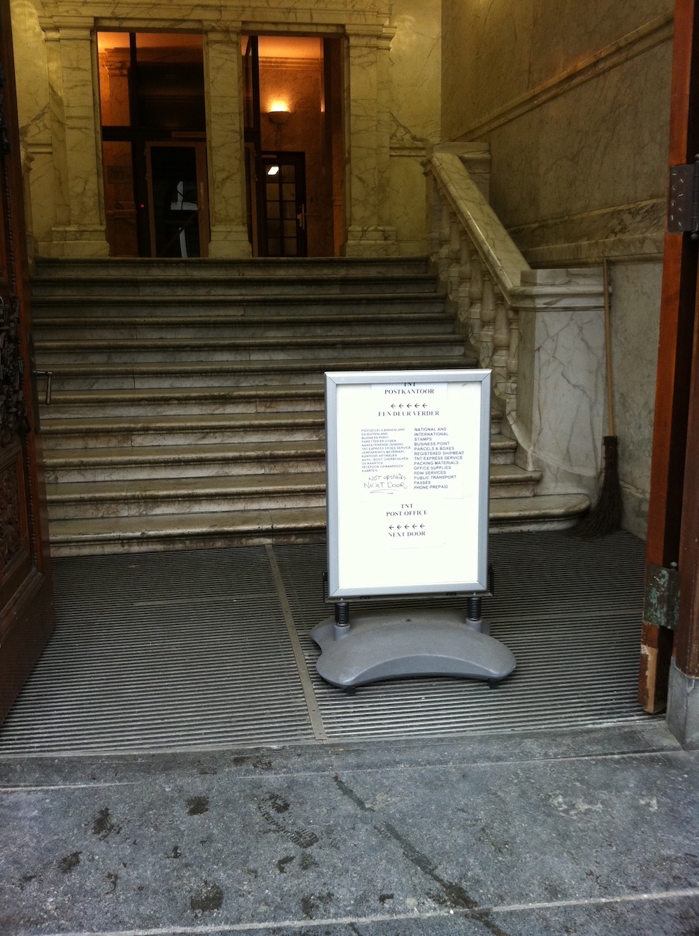
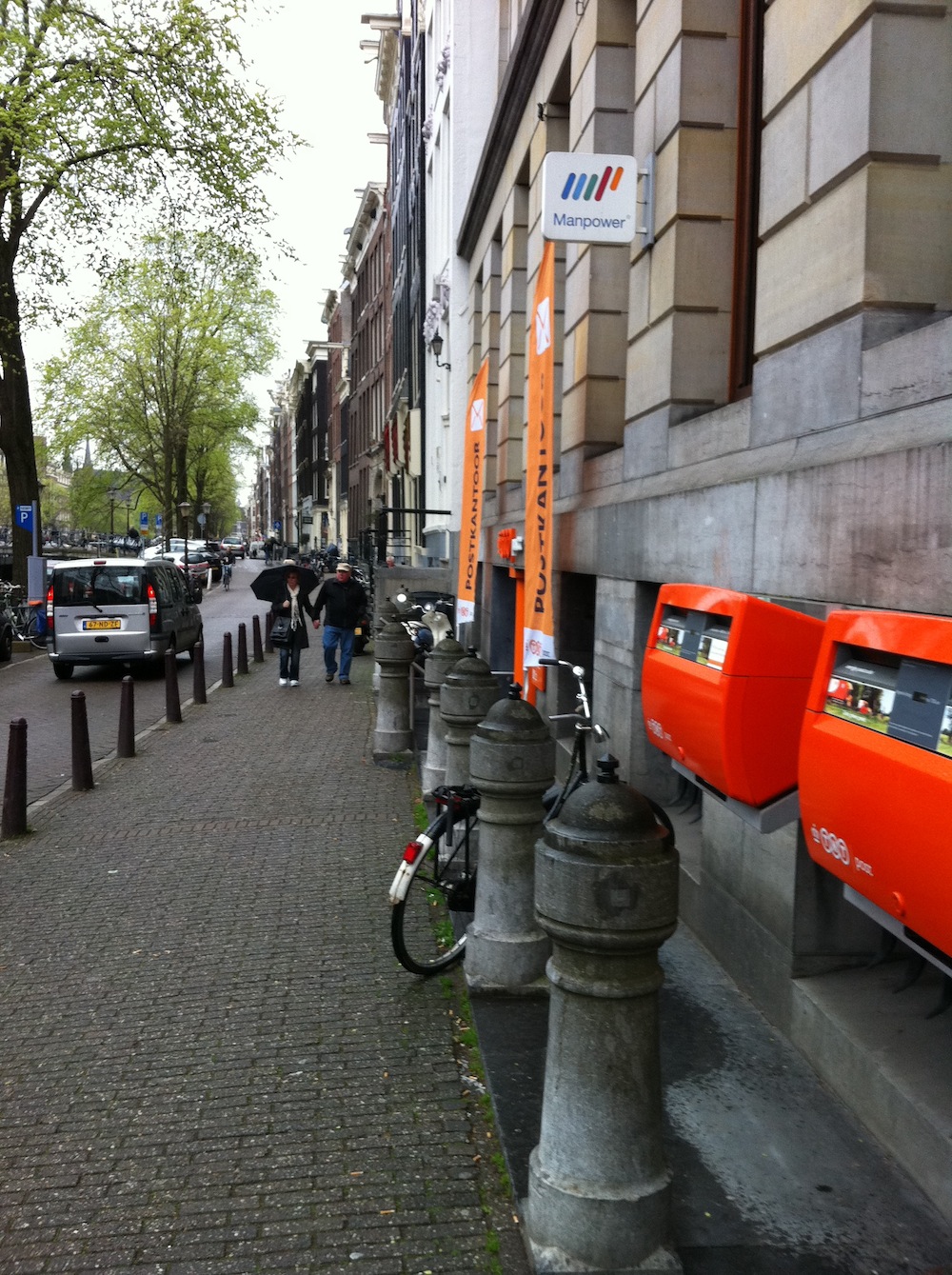
I am a big fan of Big Visible Charts, also referred to as Information Radiators. By radiating information using such charts everything is visible and people can use that information to act upon it. Recent observations made me realize that not all charts are visible though. Even when they are big and in your face. Currently I am working at a client that is located in the centre of Amsterdam above the old postal office. In January or early February the postal office closed. This was announced about a year ago and I remember big visible signs were on the walls and doors to point the customer to the fact it was closing; on which date and where the new postal office would be located (this was next door actually). A few weeks after it closed I started noticing that whenever I was outside grabbing some fresh air (or smoking if you wish :-)) people still came in, walked the up the stairs to find out that the postal office was closed. This happened every single day for a couple of weeks at least 3 times per cigarette. And these people were not only tourists but also knowledgeable Amsterdammers. In the first couple of weeks the only thing that changed was that the original postal office sign itself was removed. People still walked the stairs only to find out the postal office was moved. After the first couple of weeks the new owner probably got fed up with people coming up to the new store and asking directions to the postal office: A new big sign was placed in front of the door that indicated the postal office was moved. At the same time the new postal office next door placed huge banners with their logo. New big sign.
 Postal office next door.
So clearly these Big Visible Charts should be noticed by everyone you think right? Well wrong. While enjoying fresh
air I observed some people looked at the sign but ignored it, and some people didn't even look at the sign and walked
straight by it.
When observing this I realized I experienced the same things in projects. Even though the information was there, it
was visible and big, it was still ignored. Why did this happen? Why do people ignore this information? Here is my
short analysis:
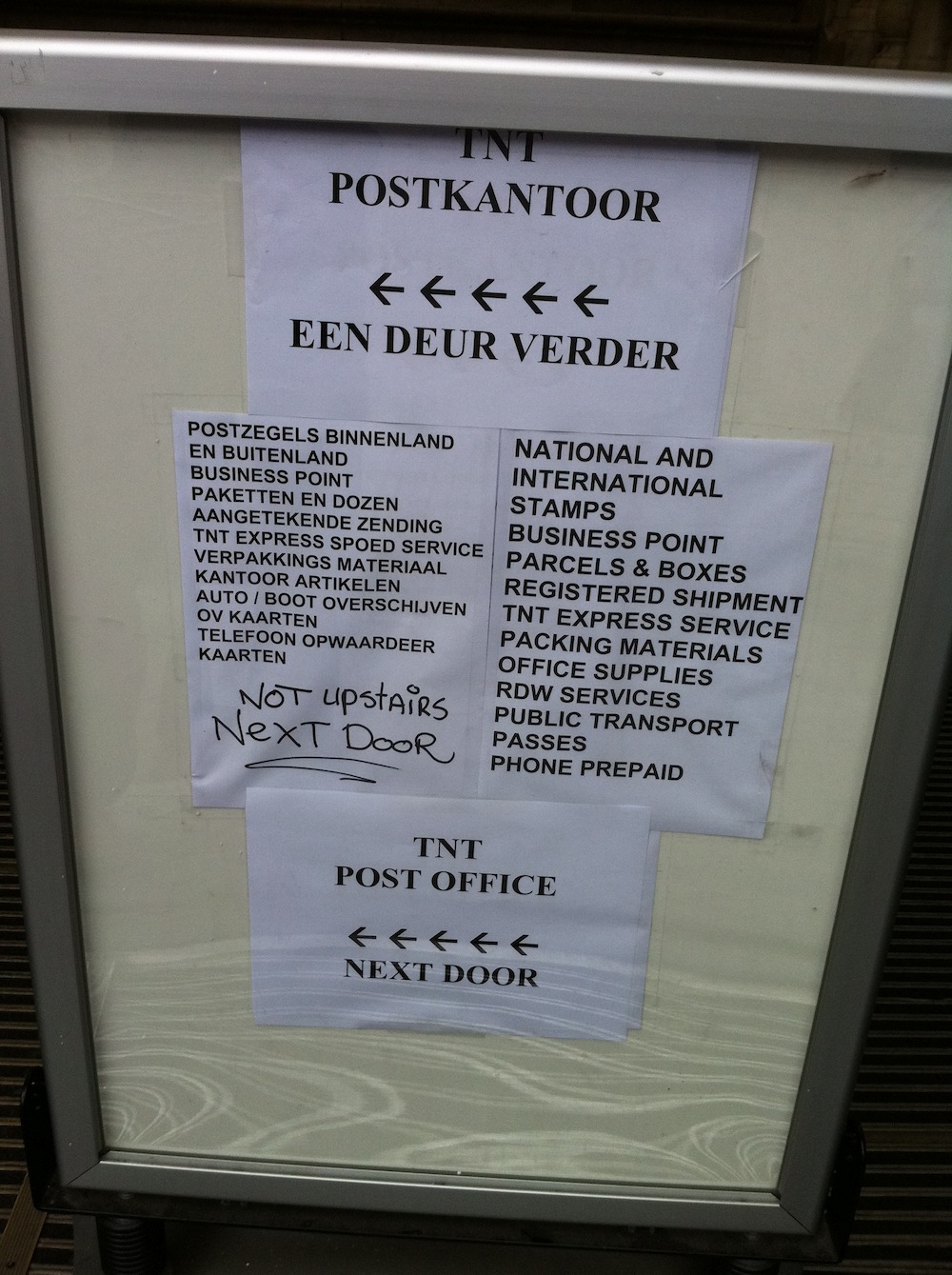
- The sign was not clear. Looking closer at the sign you see a lot of information. It is so much people
probably don't know where to start reading. If this happens people will discard the complete sign.
 Sign with information overload
 - Habit. Habits are difficult to kill. This probably applies to most Amsterdammers who came into the building expecting the postal office. They knew from their year long experience the postal office is there. They probably discarded the sign as advertisement or something else and just went straight for their goal.
- Pointed to the wrong direction. I noticed several tourist were brought to the location by taxi drivers. The taxi drivers didn't know it was moved. Without questioning the tourists followed directions and just walked in the building to discover the postal office was gone.
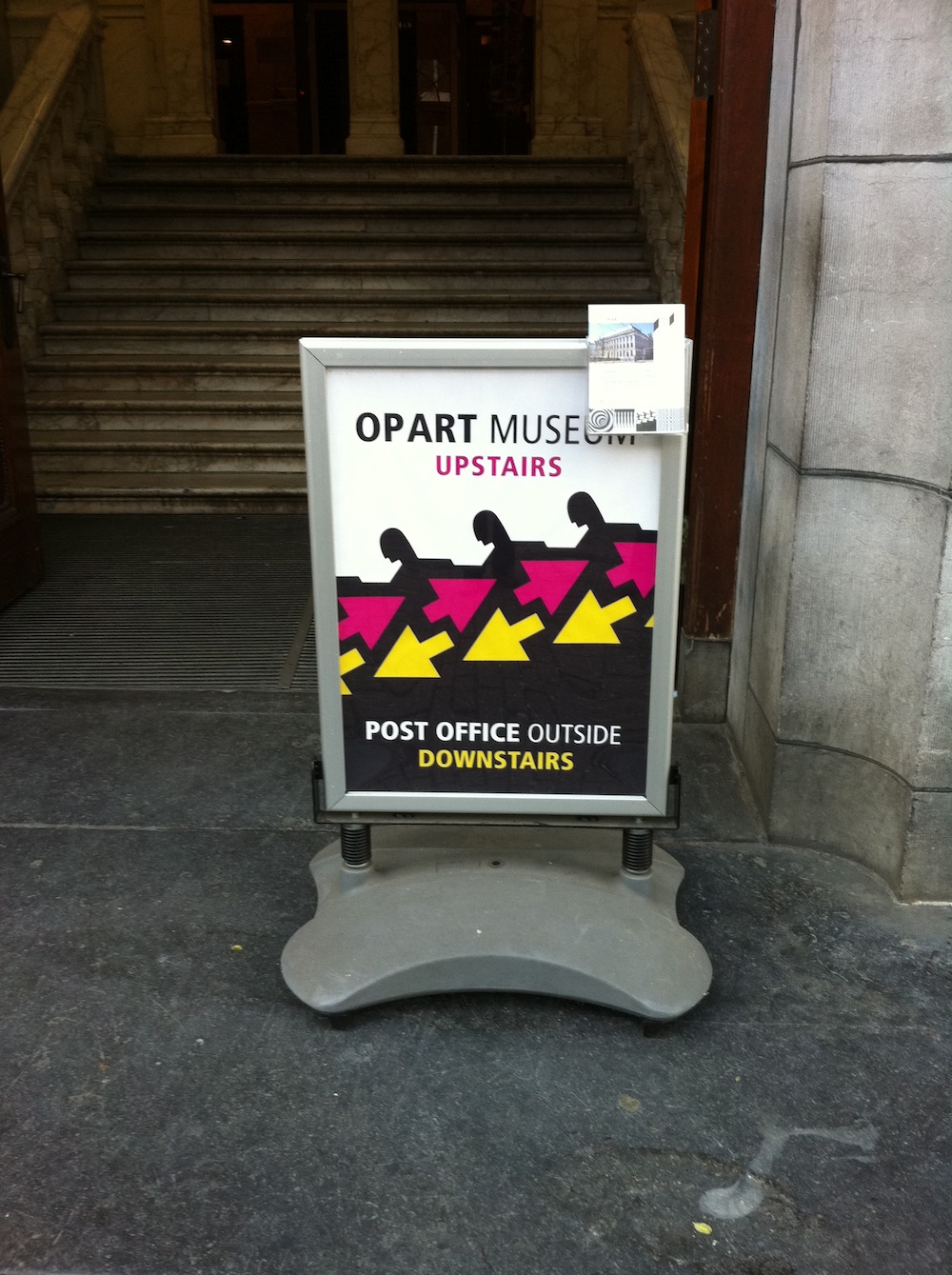
 Improved sign
How does this relate to my work?
From time to time I experience what can happen if radiated information is not understood, not seen or misinterpreted.
This goes from completely ignoring the information, to killing a project after the first sprint because the "radiated"
velocity was not enough.
When using Big Visible Charts we should take care on what we want to achieve by radiating this information, otherwise
we might not reach the goal we want to achieve. When I started to think about this more consciously I discovered that
I actually apply the following guidelines when creating these charts:
- Educate! Big Visible Charts are not enough. People must learn how to read these charts and act upon it. This especially goes for doing Agile projects in traditional environments. People in these settings are typically not used to get that much information in such short time.
- If it is outward-facing information (e.g. for stakeholders) then the readers need to be able to understand it in a couple of seconds. Don't use a lot of words, but use pictures or simple charts instead.
- If it is inward-facing information (e.g. for team members, product owner) then it can be fine-grained with details.
- You could try to physically separate the outward-facing information charts from the inward-facing information charts.
PS: After googling I also found some studies about successful (commercial) signs, for instance: https://web1.msue.msu.edu/imp/modtd/33719792.html. This also contains stuff like color schemes and such. Do you know more?